The idea behind this whole project was that it would be relate-able to the general public. Then once that was decided two weeks were spent developing a character that these thoughts could go through. The character did not pan out. Once these possibilities were exasperated then the idea of relating to the audience had to go through a different path. The visuals of a character were transformed into the idea of this whole thing becoming its own sort of attitude.
This was achieved through language, with catchy sayings being assigned to each of the five points. The phrases would stick in the viewers heads as they are traveling through the space and stay with them as they went on about their daily lives. The idea was that they would be thinking of all that they could have if they lived in a world of the five points.
The visuals of the exhibit would carry the personality of a main character without having a burning focal point of one. The images are treated with a very modern bold style. They are cut away from their background and gradient mapped. The collages that they make are and interesting story of Corbusier's work and the five points as well. The power of the experience will be the main driving point of the persuasion of the viewers to follow the ideas of the five points.
The interactive pieces, touch tables, will further reinforce the idea by adding an additional information in a comparison form. Seeing the way his ideas function in comparison to the buildings of today will push the five points into concrete thought. So in short, an exciting charismatic visual system paired with an ability to gain a deeper understanding of the ideals behind them will create a memorable experience for a broad range of viewers living in the present world.
me
Monday, February 28, 2011
Sunday, February 13, 2011
wireframe sketch
here is the first rough sketch of how an application for the Iphone could be used for understanding how products effect the earth.
Friday, February 11, 2011
Sunday, February 6, 2011
concept
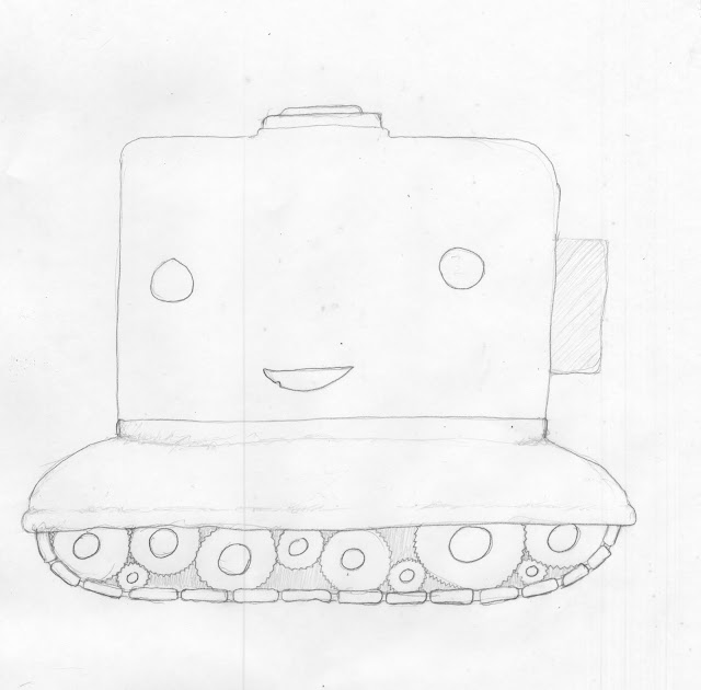
for the corbusier exhibit, my partner and I have decided to use humor as a balance to the technical and serious nature of this essay. The idea is that the building is personified as a character that is interesting and can easily get across the main points.
the five points as the building:
supports - his strength
facade - well dressed
windows - able to see more amazing things
rooftop garden - a good host and fun to be around
floor plan - up for anything
here are some concept drawings of the character.
a manly building
a more friendly building
and then he fights a bear
Thursday, February 3, 2011
Thursday, January 27, 2011
two assumptions and the experiments to follow
I will be working with tracking ones own impact on the earth by having people log their experiences on an online community that allows them to see their progress along with others progress and also help motivate them to becoming more responsible people.
Assumption
there is enough trash that could be recycled daily to make this an exciting sort of experience something to do on a regular basis.
Experiment
have someone track their daily recycling output to see if this is measurable.
Assumption
people will just want to get involved in the activity once there is a way to track progress.
Experiment
Survey on non-recyclers
test difference in amount before knowing about the hub and then after it is known to them.
Assumption
there is enough trash that could be recycled daily to make this an exciting sort of experience something to do on a regular basis.
Experiment
have someone track their daily recycling output to see if this is measurable.
Assumption
people will just want to get involved in the activity once there is a way to track progress.
Experiment
Survey on non-recyclers
test difference in amount before knowing about the hub and then after it is known to them.
notes on Le Corbusier
some notes on the first three points (out of five) and a few sketches. I am getting some ideas about the rooftop garden, the supports, and the walls that make up the building itself. I beleive that the top of the house as well as the bottom would draw in people for the relxation that it could provide, while the floors are the completely manipulable body of the structure with most of the living done in them.
Monday, January 24, 2011
Carrer Goals
Well, recently I have been quite interested in social change and advocacy. One of my goals as a designer is to end up in a position that allows me to think ethically about the path a project is taking. I think that I am motivated most when what I am doing has the goal to better the community or even make a change in the world. At first it was about making cool things and now I am leaning closer toward designing a better, more responsible place to live. Being a creative director or a designer for a company that has these issues in mind is where I would like to end up.
click
the girl effect
ALR
Tuesday, November 30, 2010
proposal
I propose to build my own site using css and JavaScript. It will be a fairly simple straightforward design allowing the user to view exactly what they are interested in or everything at once. The bottom text will be a design related thought that will change from time to time. This will add more value the experience. The bright poppy colors reflect my energetic positive attitude.
Monday, November 29, 2010
Wednesday, November 17, 2010
Thursday, November 4, 2010
Rosedale Fresh
first visual direction for the feel of the Rosedale fresh mobile market identity.
It is organic, fun, and friendly. This is to attract a younger age bracket to eating healthier. The organic shapes will be used in all promotional material and the signage.
more to come soon.
Labels:
visual advocacy
Saturday, October 23, 2010
hub pregression
This was the state of the hub when my first presentation was giving. It was nowhere near where it should have been, and it needed much improvement.
Here is a more refined version. The colors are no longer Malibu, there is a title to the page and the tools on the side are more thought out and refined looking. I still have some tweaking but I think it has been improved substantially.
Labels:
multimedia experience
Friday, October 22, 2010
the direction
So the direction that sparked the most interest was the idea of the mobile produce dilivery system. It could include order forms, specific routes, uniforms, vehicle graphics,and promotional items.
Labels:
visual advocacy
Thursday, October 14, 2010
prototypes
the first system is a prepackaged healthy meal that would be specifically create food choices that are fast and viable options to go up against fast-food or a frozen unhealthy alternatives.
The Second direction was discovered recently. through a few interviews I discovered that Rosedale is a "food Desert". A food desert is a place that is isolated from a food source. Food deserts happen in areas far away from grocery stores, communities in which transportation is scarce, and sub-communities that are separated from the main structure of the city. Rosedale seems to be all of the above. I did some research and there are several resources working on this specific problem. The funding and promotion of these resources is very limited at the moment so an awareness campaign would be a great way to gain awareness and pull in more funding. If more people know why there is a problem more people may take the initiative to do something or at least spread the information themselves.
This was the First study of using a map to pinpoint a spot that needs attention.
the second attempt was to map the area visually with color. As the lack of local stores increased the color becomes more and more dismal.
The last look is a more efined version of both ideas with an explanation of the situation and also ways go get more information on how to join the cause or get more information.
Labels:
visual advocacy
Wednesday, October 13, 2010
unmanned systems visual direction
Here is the second phase in the process of creating an identity for an unmanned systems company. The choices have been boiled down to the three directions which best represent the company and from there a final route was chosen to continue upon. I have selected the identity that references measurement and sighting devices. I feel the it best embodies the company attributes of Precision, Dependability, and intelligence.
Sshockley p2 Keynote
Labels:
design systems
Sunday, October 10, 2010
Here is a three dimensional model of a website. as the user rotated the site some of the spaces would appear and some would dimensionally disappear. The backs of the elements would contain different information. So, there would be one space and four different layers of information. So, one side of the object may be a completely different theme or set of information than the other, but could all be open at the same time.
Labels:
multimedia experience
some functions of the hub and an explination of nav.
The main navigation works with a scroll wheel. each of the icon on the wheel is connected to a specific page. once the user goes to a page and alters the screen it is saved for the session. This allows the user so scroll through multiple pages and multitask without having to reload the pages and the data each time. So the work flow that the interface that this interface is sped up and more intuitive you never really leave any page behind.
the map appears with three options, search by the danger of an area, search by the distance away from your current location, how much paranormal activity a certain place has, and then a search bar.
as data is entered locations start to appear on the map
and as you get more specific the dots drop off of the map
when you roll over a location it gives you a very brief synopsis
and a more in depth profile can be viewed
Labels:
multimedia experience
Subscribe to:
Posts (Atom)